Editorial and print
Campania Teatro Festival — catalogue and programme
Graphic design and layout for a cultural programme: typography, imagery and content organised as a coherent editorial system.
Finding a path through stories and programme details
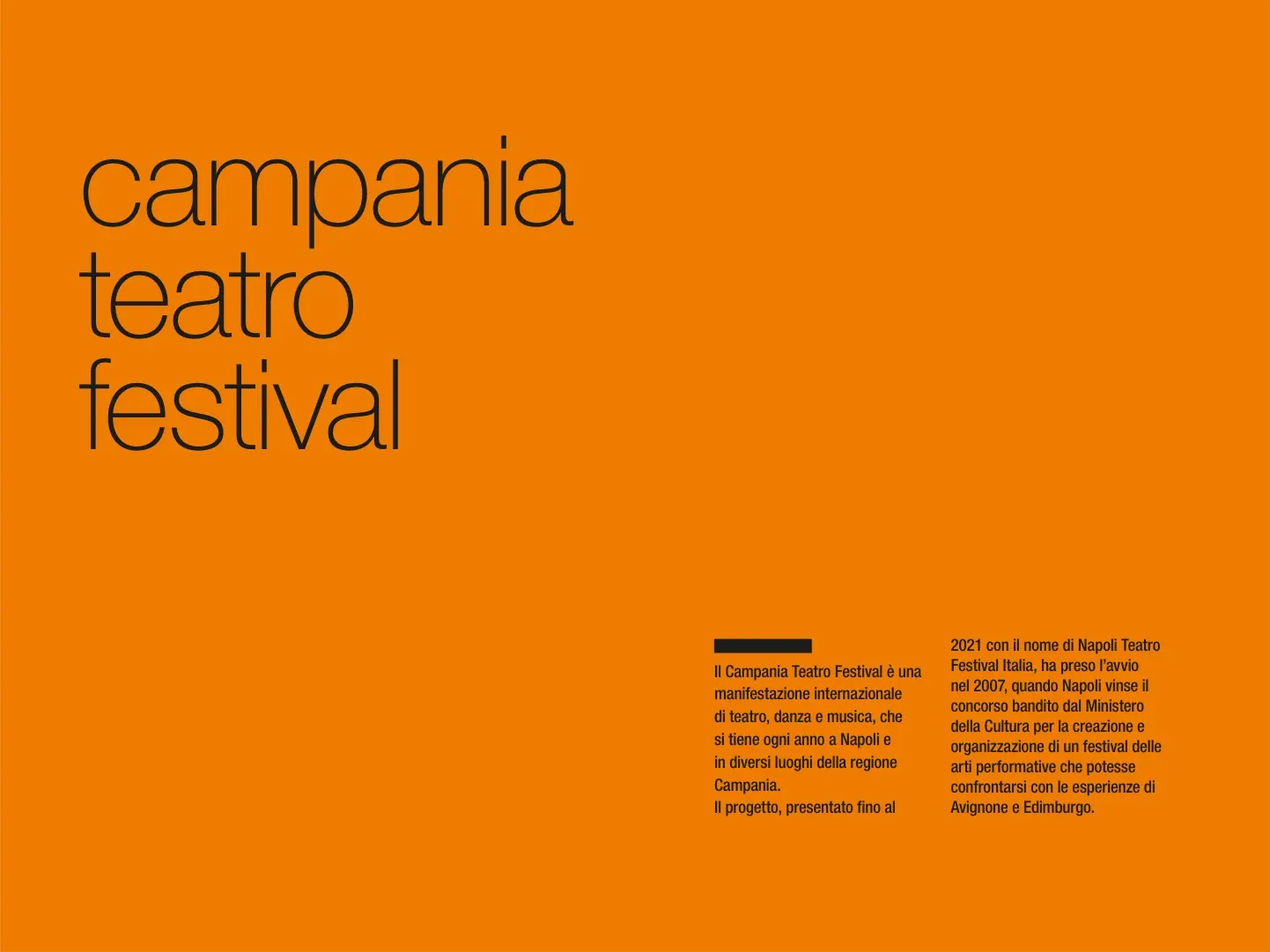
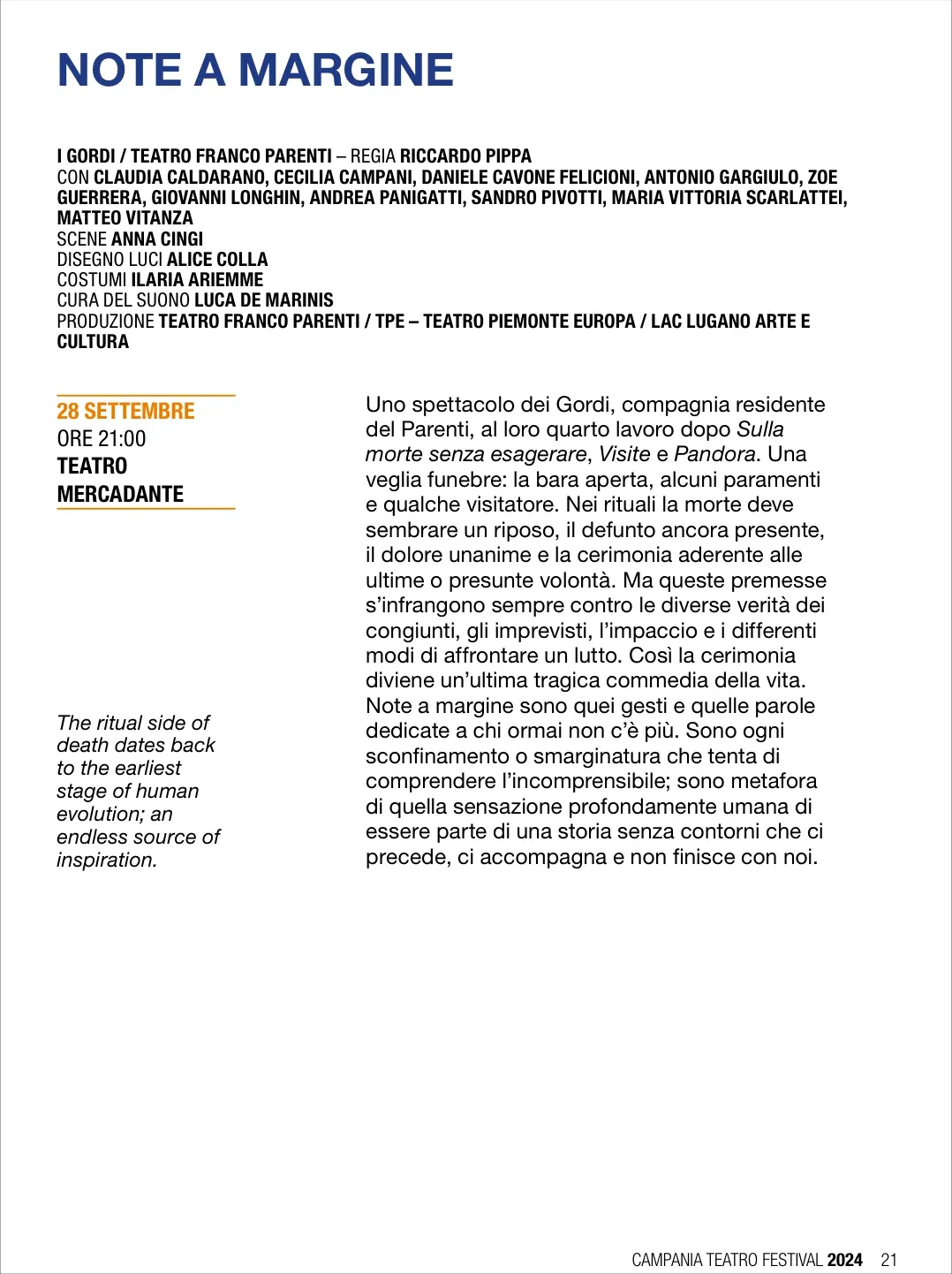
The Campania Teatro Festival catalogue organises cultural content, performance information and introductory text through a coordinated graphic system. The orange cover introduces a structure that leads from the contents page to entries in the 2024 programme, including Note a margine. On that page, the title, credits, date, time and venue are distinguished from the descriptive text and English content. Graphic design and layout organise information with different purposes, creating a visual connection between the opening of the catalogue and the consultation of individual entries in the performance programme.
Design objective
The structure allows the cultural catalogue to be read as a narrative and consulted as a programme. Individual entries hold titles, credits and practical information alongside descriptive text. The editorial system addresses this density by giving each kind of content a recognisable position and hierarchy, supporting both browsing and more focused consultation.
The work
The project includes graphic design and layout for the catalogue and programme. The cover and contents page use orange as a recognisable visual element. In the Note a margine entry, the composition separates credits, date and venue information from the descriptive text, with English content also given its own place on the page.
Design rationale
Typographic differences between title, credits and description help readers identify the level of information they need. Grouping the date and venue creates a clear reference within each entry. Recurring colour and hierarchy connect the pages, while white space separates dense content and gives practical details and descriptive passages distinct areas within the composition.