Editorial and print
Bartales — magazine editorial design
Concept, layout and editorial system for a magazine dedicated to beverage and lifestyle. A structure that brings together storytelling, imagery and reading hierarchy.
An editorial system for beverage stories
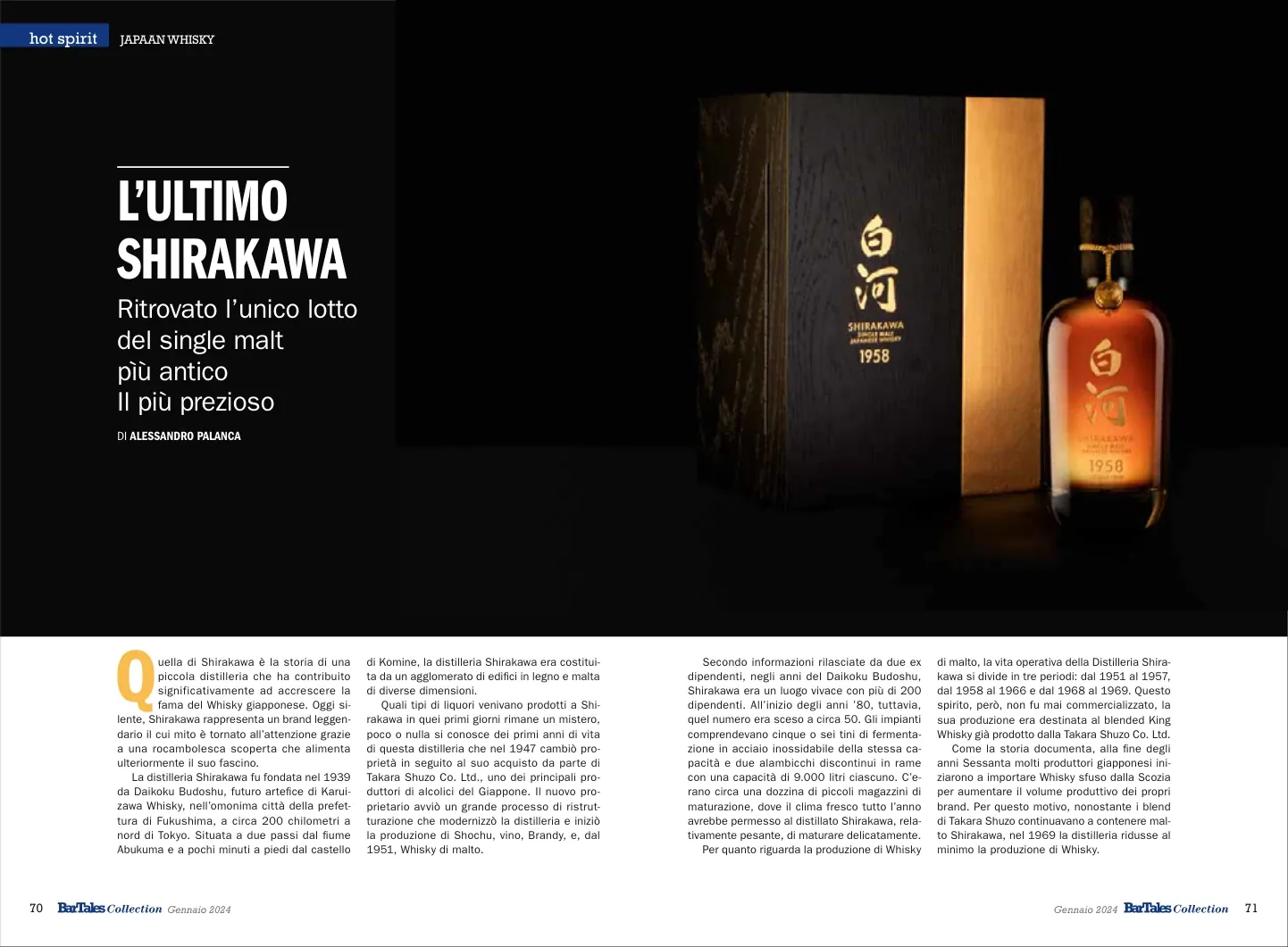
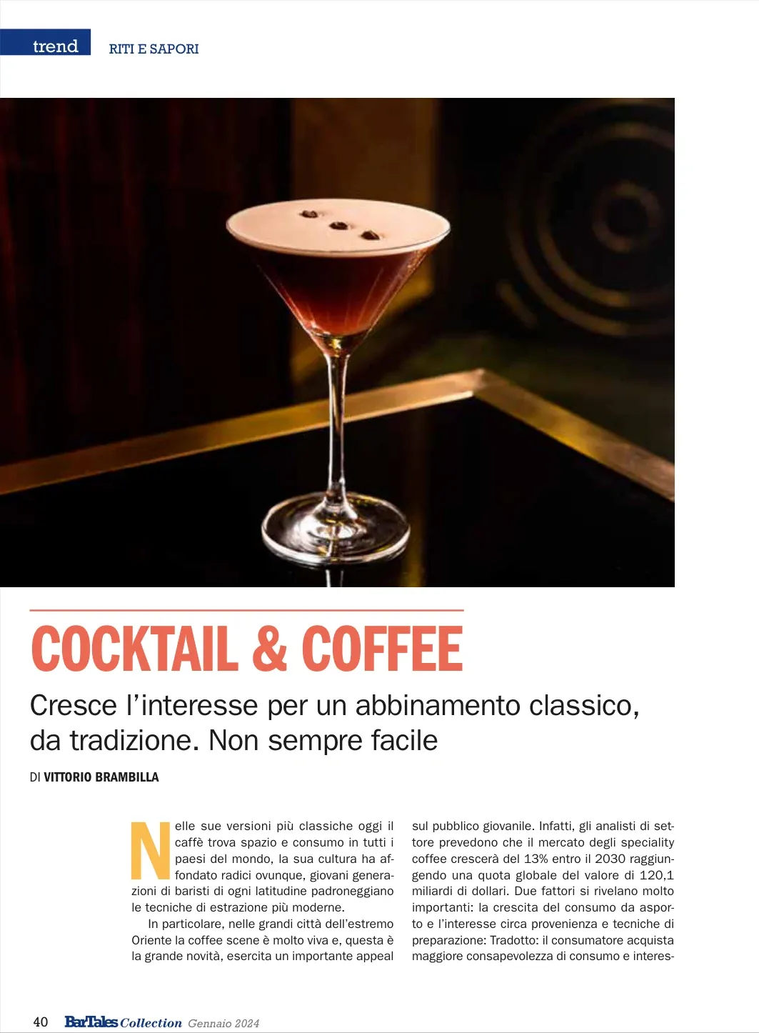
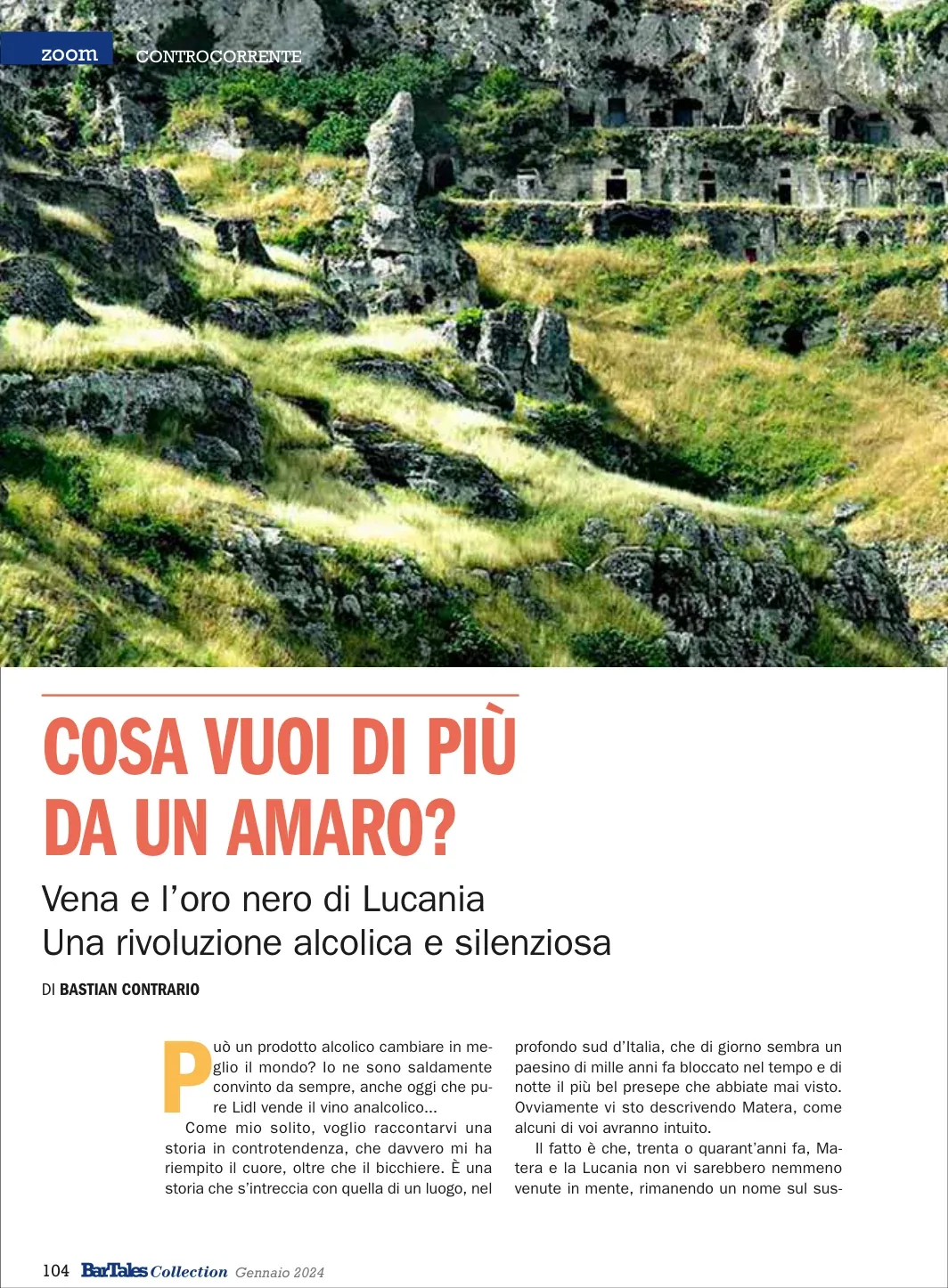
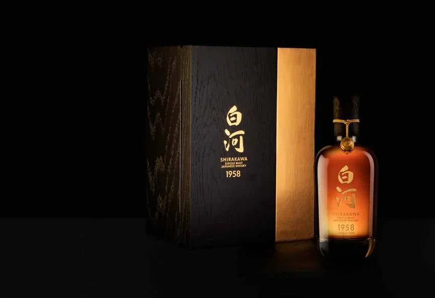
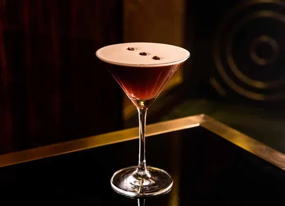
The Bartales project covers the concept, layout and editorial system of a magazine dedicated to beverage and lifestyle. Features about Shirakawa whisky, cocktails and coffee, and the world of Italian bitters take shape through article openings and spreads. Product and landscape photographs sit alongside headlines, opening sections and text columns, with typographic hierarchy marking different stages of reading. The Shirakawa spread combines a large dark opening with a band of text on a light background. The work brings distinct subjects together within a recognisable magazine language, balancing the space given to images with the demands of longer editorial content.
Design objective
The editorial system gives a shared structure to articles with different images, subjects and amounts of text. Openings introduce each theme, and the following pages support longer reading. The design addresses the relationship between a recognisable publication identity and the particular character of each story, from product features to broader lifestyle subjects.
The work
The work includes concept, layout and the organisation of editorial hierarchy. Photographs occupy generous areas, headlines introduce the articles and body text is arranged in columns. Features on Shirakawa, Cocktail & Coffee and Italian bitters develop this system through imagery and openings specific to each subject.
Design rationale
Photographic openings provide an immediate reference for the subject, while columns organise longer text into readable units. Contrasts between dark and light backgrounds distinguish the image-led opening from the article’s detail on the spread. A stable hierarchy helps readers find their way even as the topic and photographic approach change between stories.